Die Farbe Rot, Lieblingsfarbe, Farbe der Liebe, der Leidenschaft aber auch des Zorns und des Hasses. Ich beschäftige mich ja seit einer kleinen Weile damit, weil ich bemerkt habe, dass sie in meinen Bildern relativ wenig vorkommt.
Nach den ersten Experimenten, die ihr in diesem Video sehen konntet, haben sich zwei Wege aufgetan, mich weiter mit dem Rot zu beschäftigen. Einerseits die Frage nach den Motiven, die ich mit Rot in Szene setzen kann, andererseits die Frage nach Farben, die das Rot ergänzen.
Die Frage nach möglichen Motiven hat mich zuerst mal zum Schreiben gebracht. Ich habe in meinen Atelier-Journal eine Mind Map angelegt, ein Cluster mit Begriffen, die mir dazu eingefallen sind.

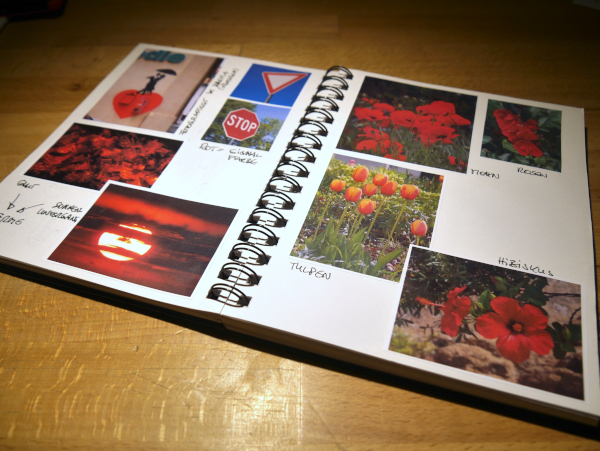
Und natürlich habe ich Fotos zum Thema ausgedruckt, im Atelier-Journal eingeklebt und ein paar Notizen dazu gemacht.
Dabei sind mir drei Künstler in den Sinn gekommen, die sich mit Farben, Farbharmonien und Farbwirkungen beschäftigt haben. Paul Klee, Josef Albers und Mark Rothko. Drei ganz unterschiedliche Maler mit unterschiedlichen Arbeitsweisen. Aber bei allen habe ich etwas zu meinem Rot-Projekt gefunden.
Aus Urheberrechts-Gründen kann ich euch hier leider keine Fotos der Bilder zeigen. Wenn ihr den angegebenen Links folgt, könnt ihr sie euch hoffentlich dort anschauen.
Paul Klee (1879 – 1940)
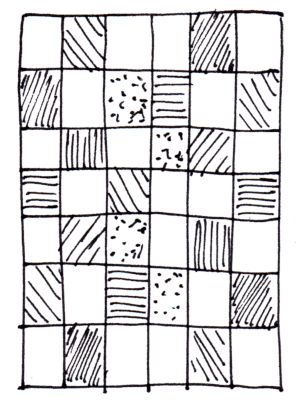
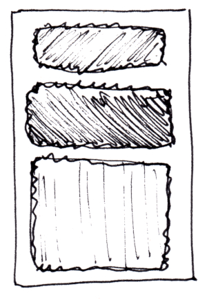
Von ihm gibt es einige Werke, in denen er Quadrate oder Rechtecke in verschiedenen Farben zu einem Mosaik zusammenstellt. Ein Beispiel ist “Neue Harmonie” von 1936.
In einem Raster werden einige Rechtecke in verschiedenen Rottönen kontrastiert mit einerseits kräftigem Grün und andererseits matten Oliv- und Brauntönen. Diese Kontraste machen das Bild lebendig trotz der regelmäßigen Aufteilung.
Link zu Meisterdrucke.ch
Josef Albers (1888 – 1976)
Er ist bekannt vor allem für die 1950 begonnene Serie “Homage to the Square”. Jeweils drei oder vier Quadrate in unterschiedlichen Farben bzw. Farbtönen sind ineinander geschachtelt und zeigen die Wechselwirkung zwischen benachbarten Farbflächen.
Es gibt Quadrate nur in Rottönen, aber auch ganz viele in anderen Farbkombinationen.
Link zu Life of an Architect

Mark Rothko (1903 – 1970)
Wenn man an Farbfeldmalerei denkt, dann kommen einem vermutlich sofort Rothkos großformatige Bilder in den Sinn, auf denen Farbflächen übereinander gestapelt sind, deren Kanten verschwimmen. Ihm ging es um die Wirkung der Farben – nicht nur aufeinander sondern vor allem auch auf den Betrachtenden.
Link zu DorothemumArt Blog
Wenn ich mir im Netz die Arbeiten dieser Künstler anschaue, stelle ich fest: Nur Rot ist mir zu wenig. Zu wenig Kontrast, auch wenn zwischen den verschiedenen Rottönen eine gewisse Spannung besteht. In dem Moment, wo eine andere Farbe dazukommt – auch wenn sie neutral ist – sprechen mich die Kompositionen deutlich mehr an. Ist vermutlich Geschmackssache, wie so vieles in der Kunst. Ist aber auch ein Hinweis, wohin meine Rot-Erkundungen gehen können.
A ragbag to do with red
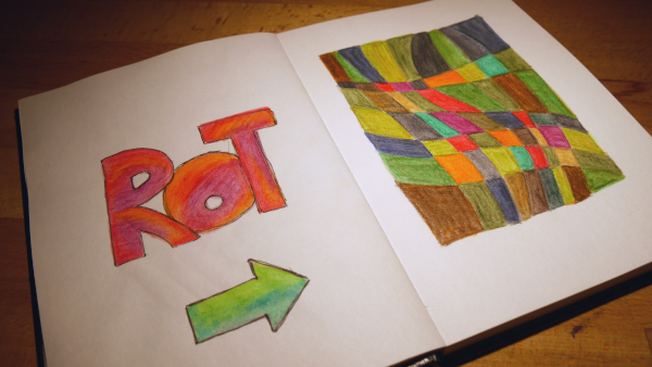
The color red, favorite color, color of love, passion but also of anger and hate. I’ve been dealing with it for a little while because I’ve noticed that it appears relatively little in my paintings.
After the first experiments, which you could see in this video, two ways opened up for me to continue working with the red. On the one hand the question of the motifs that I can stage with red, on the other hand the question of colors that complement the red.
The question of possible motives first brought me to write. I created a mind map in my studio journal, a cluster of terms that came to my mind.
And of course I printed out photos on the subject, pasted them into the studio journal and made a few notes about them.
Three artists came to mind who dealt with colors, color harmonies and color effects. Paul Klee, Josef Albers and Mark Rothko. Three very different painters with different working methods. But I found something about my red project in all of them.
For copyright reasons, I can unfortunately not show you any photos of the paintings here. If you follow the links provided, I hope you can take a look at them there.
Paul Klee (1879 – 1940)
There are several works by him in which he puts together squares or rectangles in different colors to form a mosaic. An example is “New Harmony” from 1936.
In a grid, a few rectangles in different shades of red are contrasted with strong green on the one hand and dull olive and brown tones on the other. These contrasts bring the picture to life despite the regular division.
Link to Meisterdrucke.ch
Josef Albers (1888 – 1976)
He is best known for the series “Homage to the Square”, which began in 1950. Three or four squares in different colors or hues are nested in each other and show the interaction between adjacent colored areas.
There are squares only in shades of red, but there are also many in other color combinations.
Link to Life of an Architect
Mark Rothko (1903 – 1970)
When one thinks of color field painting, one immediately thinks of Rothko’s large-format paintings, in which areas of color are stacked on top of one another, their edges blurring. He was concerned with the effect of the colors – not only on each other but above all on the viewer.
Link to DorothemumArt Blog
When I look at the works of these artists online, I realize that just red is not enough for me. Too little contrast, even if there is some tension between the different shades of red. The moment another color is added – even if it is neutral – the compositions speak to me much more. It’s probably a matter of taste, like so much in art. But it is also an indication of where my red explorations can go.